

Curatorial Review
by Oleksandr Dyvnich
Ena Radak: Making a Digital Service Tangible
Overview
Ena Radak is a Croatian creative professional based in London and Brand & Creative Director at Lyntel, with eight years across design, branding and the creative industries. Her central achievement is turning an invisible digital product, the travel eSIM, into objects travellers can see, hold and buy. Across a poster, a countertop display, a card and a vending kiosk, she builds one visual system rather than a set of one-off pieces, and that consistency is the clearest sign of her experience.
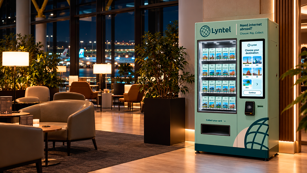
Ena Radak | Lyntel Kiosk in a Modern Airport Dragonpass Lounge
Lyntel × Dragonpass: Designing for the Lounge
The collaboration with Dragonpass, which reports more than 1,300 airport loungesworldwide, sets a precise brief: sell a digital service in a space built for rest, not retail. Heranswers are specific.
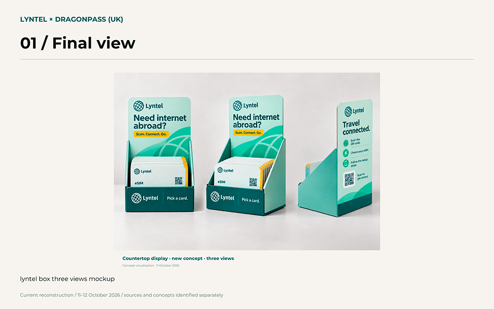
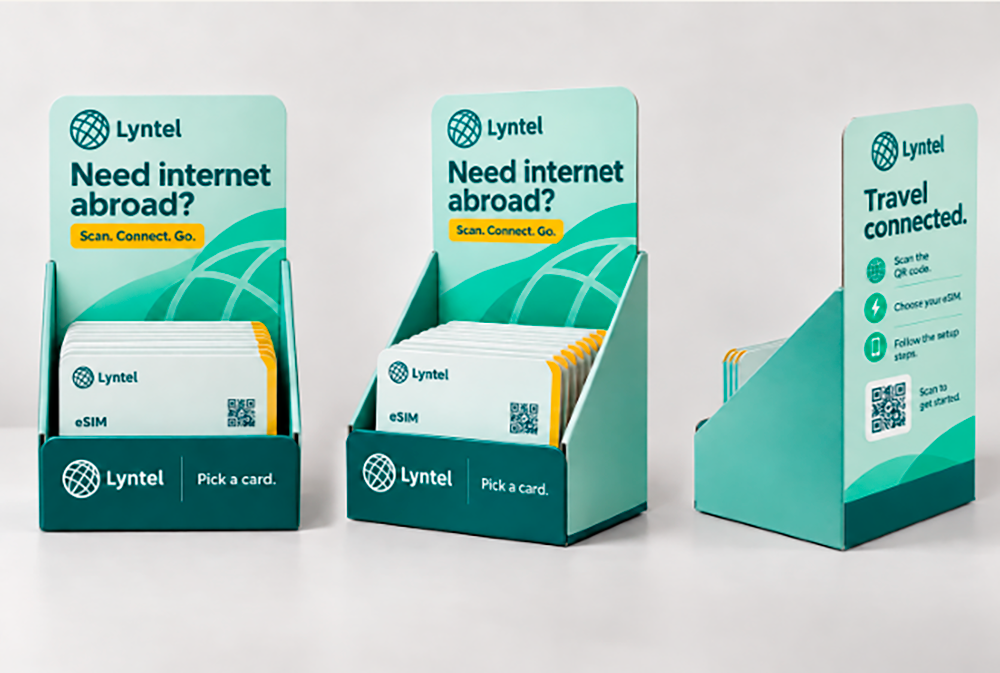
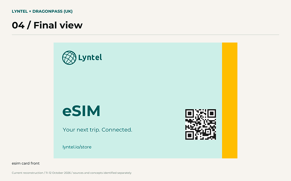
• A disciplined palette. Mint and deep teal carry the brand; a single signal yellow is reserved for action, from the “Scan. Connect. Go.” tag to the edge of each eSIM card. Stacked in the countertop display, those edges form a yellow stripe that reads across a room.
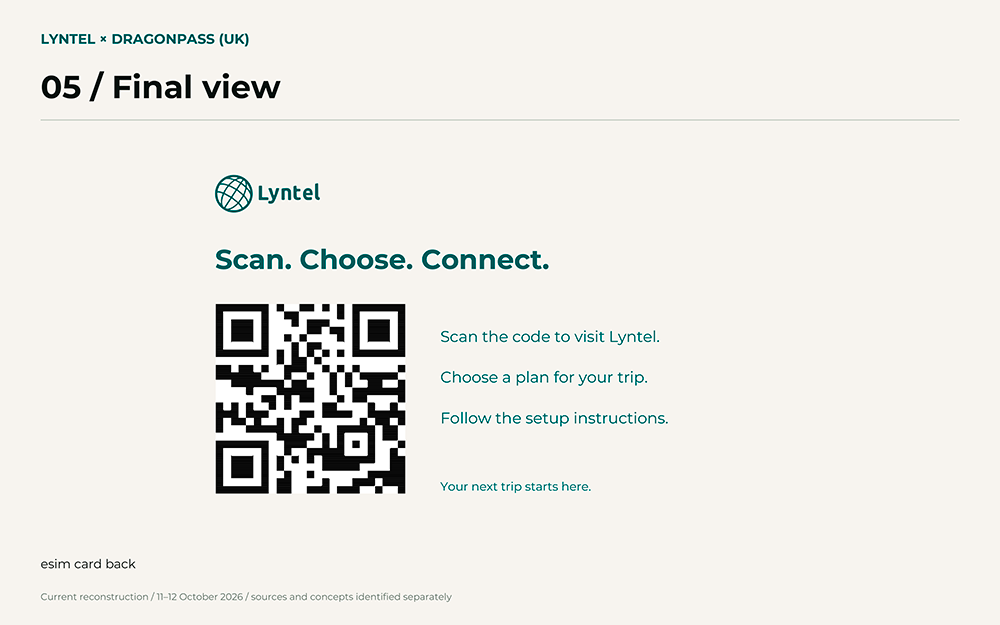
• A header that splits its job. The front attracts with a question; the back instructs in three numbered steps beside a QR code.
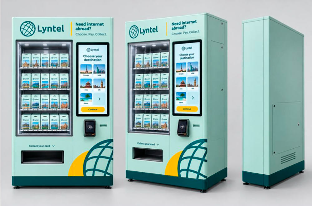
Ena Radak | Desk
• A card that makes a download tangible. Large “eSIM” type, a QR code and a store URL give the product a physical presence.
• Language-free navigation. The kiosk concept uses landmark imagery for destinations, so travellers choose by picture rather than text.
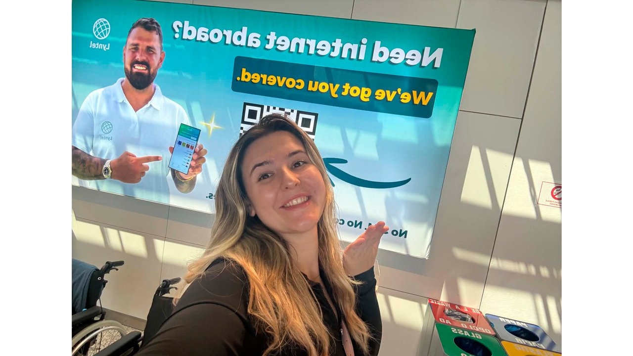
• Proof at scale. An installed airport poster shows the system already working in a real terminal.
Ena Radak | Final
Antarctica Travel Toolkit
The toolkit carries the identity into the least commercial setting imaginable. A bottle, pouch,towel with an Antarctica silhouette, selfie stick and physical eSIM cards form one coherent kit. The mark also appears on expedition life jackets beside Nomadik Travel and CrewSaver, where it must sit with partners on safety equipment without competing. The wider campaign reportedly reached about 24.2 million video views and won the Golden Click Award 2026 for Best Digital Campaign. Those results belong to the campaign as a whole, but the toolkit gave it real objects to show on camera.
Ena Radak | Desk
Critical Assessment
The work has clear limits. The kiosk and lounge placement are still concept visualisations, and the countertop display’s structure and substrate await a fabricator, so the real test is production. The system now carries three different taglines (“Scan. Connect. Go.”, “Choose. Pay. Collect.”, “Scan. Choose. Connect.”), which risks blurring a single brand voice. The display front repeats the logo three times where one would do, and pale mint may lose contrast under bright lounge lighting.
Ena Radak | Final
Conclusion
Radak’s strength is systems thinking applied to physical space. She decides where colour, type and instruction belong, then holds those decisions steady from a card to a kiosk, and eight years of practice show in that restraint. Her potential lies in carrying these concepts through fabrication and user testing, where convincing visualisations become proven brand experiences.
Ena Radak | Final
Her next step is to unify the verbal system and give the kiosk and card an illustrative language as distinctive as the colour palette, so that the brand is recognised as much by its voice and imagery as by its colours.