
Curatorial Review
by Oleksandr Dyvnich
Dominika Białas builds her portraits the way a face is actually built over a lifetime: in layers, under pressure, with damage left visible rather than smoothed away. Across the drawings, the linocut, and the oil pastel portraits submitted here, the same conviction holds — that a face worth looking at twice is one that has been lived in, and that dignity is not incompatible with distortion. This is portraiture as excavation rather than flattery, and it is at its strongest precisely where Białas lets the surface tear a little.
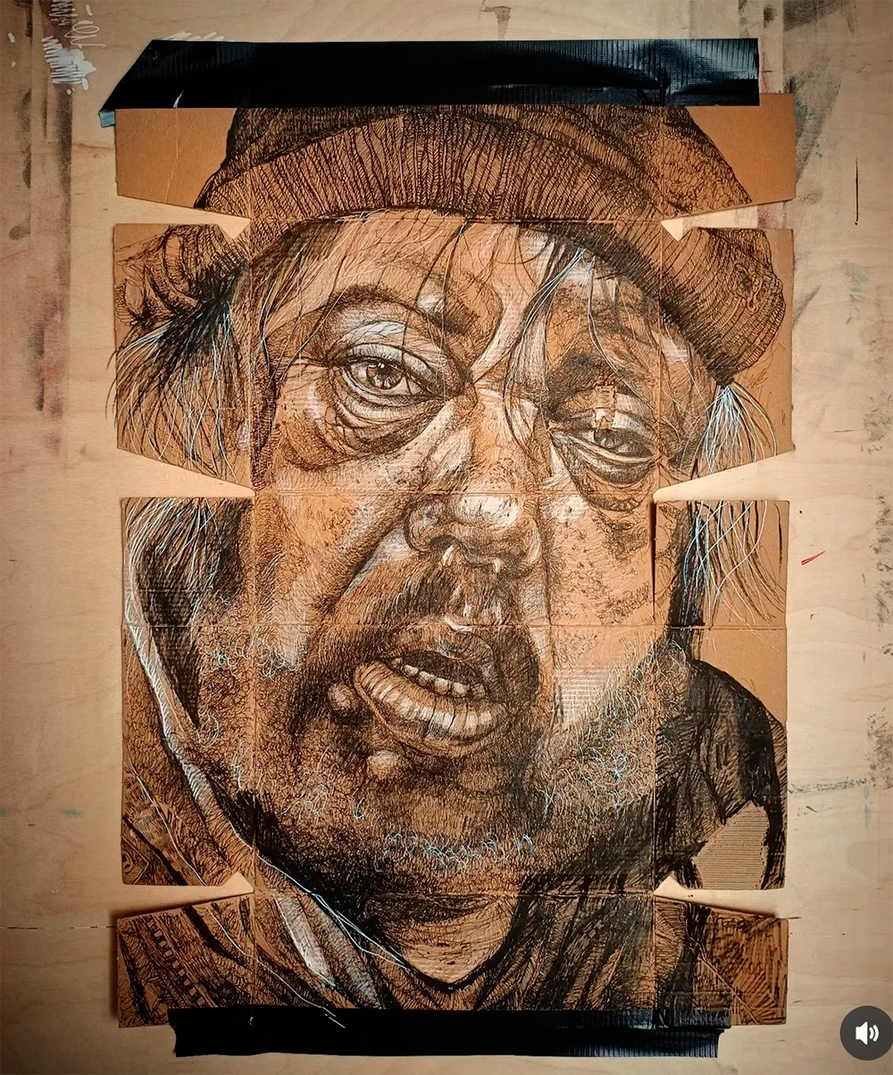
The ink drawings on cardboard are the boldest proposition in the set. Working directly on a salvaged, creased surface, Białas lets the packaging’s own fold lines and torn tabs interrupt the face — a crease runs straight through a cheek, a flap of raw cardboard breaks the jaw. Rather than fighting this, she scores it into the drawing’s logic, so that the support itself starts to read as skin: seamed, patched, a little discarded. The linework is dense and controlled where it needs to be — around the eyes, especially, where fine crosshatching builds real weight in the sockets — and looser, almost frantic, in the hair and beard, where scribbled white highlights cut through the ink like exposed nerve. It is an unfussy, physical way of working, and it suits the subject matter: these are not idealized sitters but people whose faces have been worked on by time in the same rough-and-ready way Białas works on her cardboard.
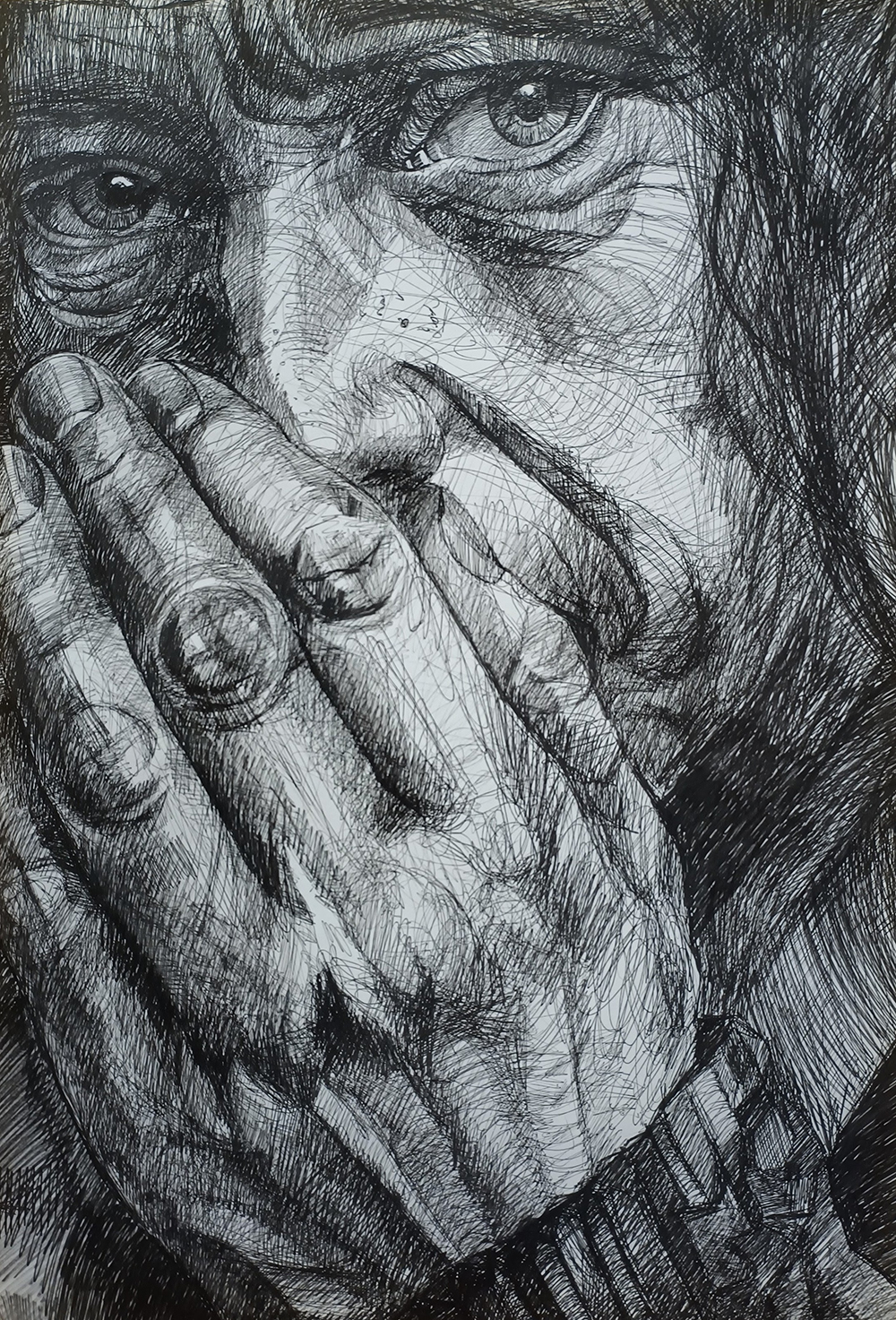
The Micron fineliner drawing of hands pressed to a mouth is the emotional center of the submission. The choice to crop tight — eyes and praying hands, nothing else — does more than any facial expression could to communicate concealment and appeal at once. The rendering of the hands is genuinely accomplished: the tendons, the compressed flesh at the knuckles, the slight sheen of ballpoint built up in patient cross-hatched layers. It is the one piece where technical control and emotional charge are fully in balance, and it is the strongest single image in the group.
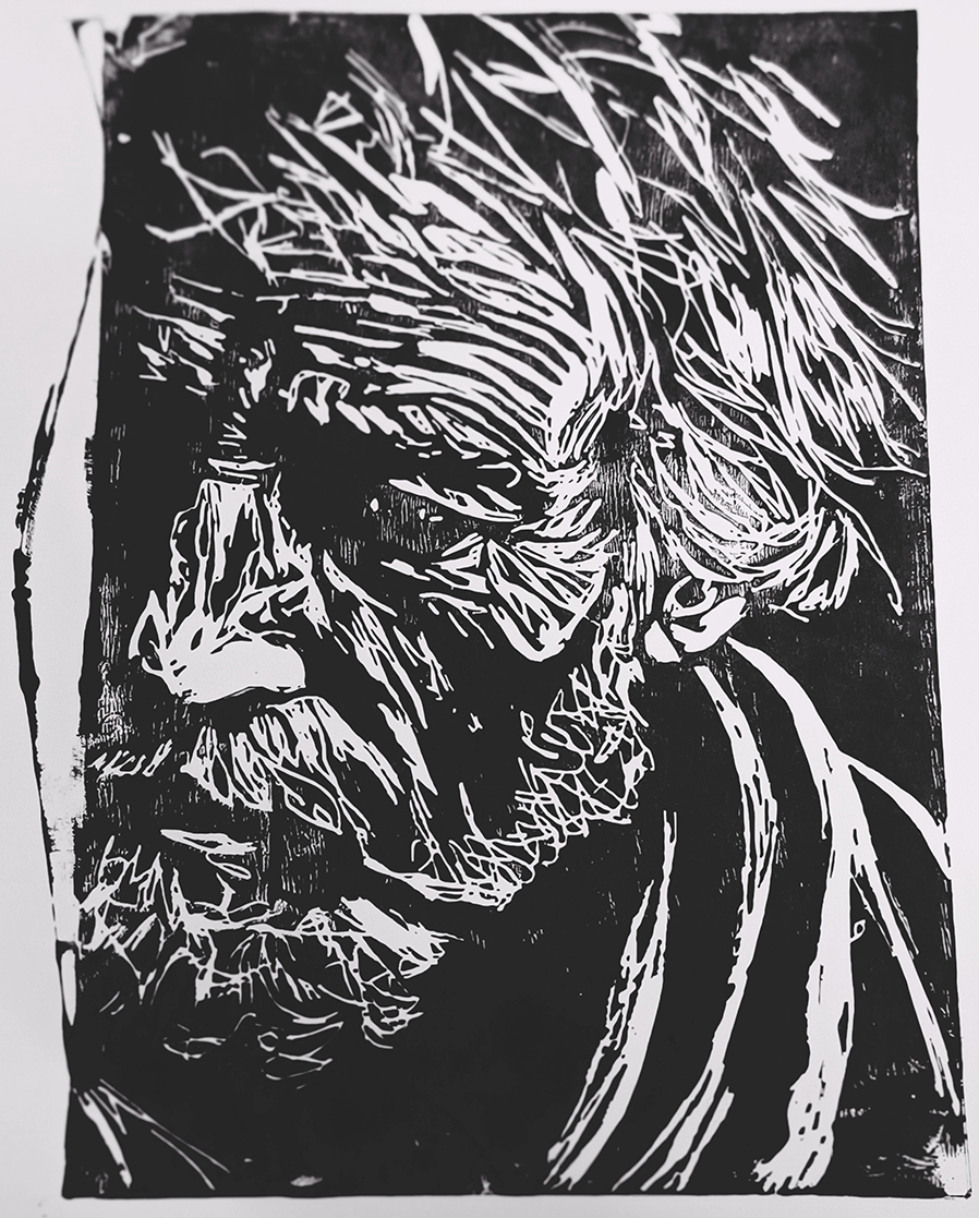
The linocut is the most formally assured piece here. Reduced to pure black and white, the carved lines have none of the drawings’ fussiness — every mark is a decision, and the negative space does as much work as the positive.
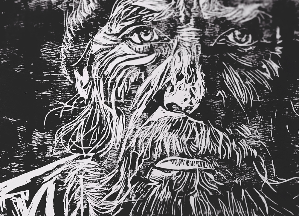
The close-up detail shot shows how much restraint that demands: the eyes are rendered in a handful of gouged lines, yet they hold the whole print together. This is the piece that best demonstrates Białas’s instinct for when to stop, and it suggests printmaking may be the register in which her control of contrast is most disciplined.
The two oil pastel portraits shift register again, trading line for gesture. Rendered in blocks of unmixed, almost arbitrary color — pink cheekbones, yellow brow, blue jaw — they read at a distance as faces and up close as pure color and mark-making, which is the intended tension.
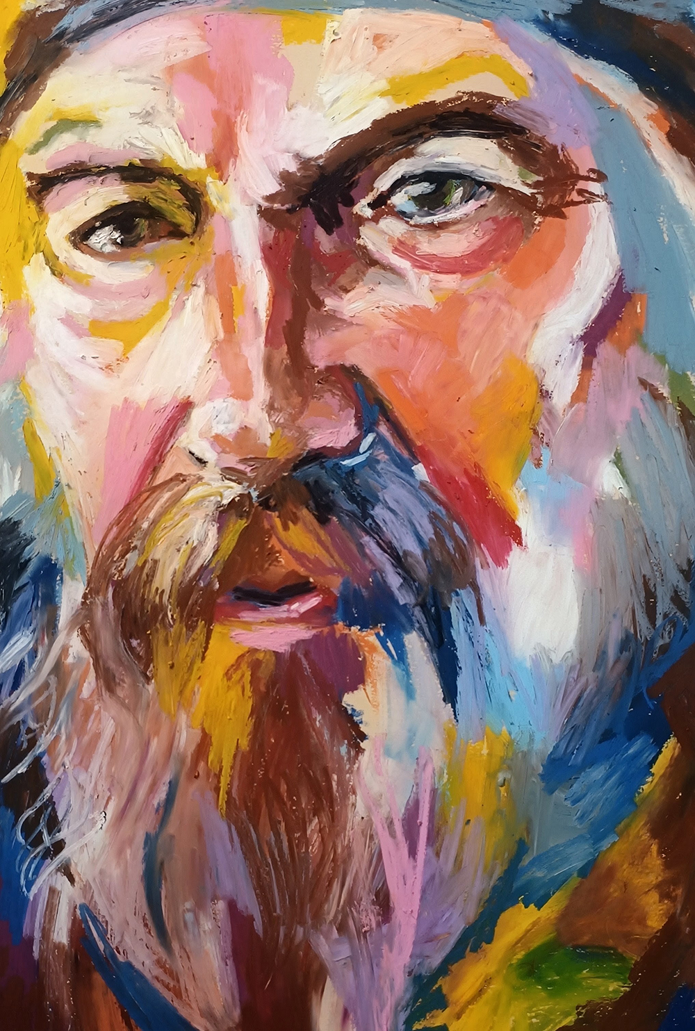
This is the least resolved work in the set: the color is used expressively rather than descriptively, in the vein of expressionist portraiture, but the drawing underneath is looser than in the works on paper, and in places the features feel located rather than felt. The eyes, again, are where the oil pastel portraits succeed most — dark, wet-looking marks that anchor the color storm around them. These read as studies in the process of finding a language in oil pastel rather than finished statements, and that is not a criticism so much as an observation about where the oil pastel works and the more linear pieces currently sit in relation to one another in her practice.
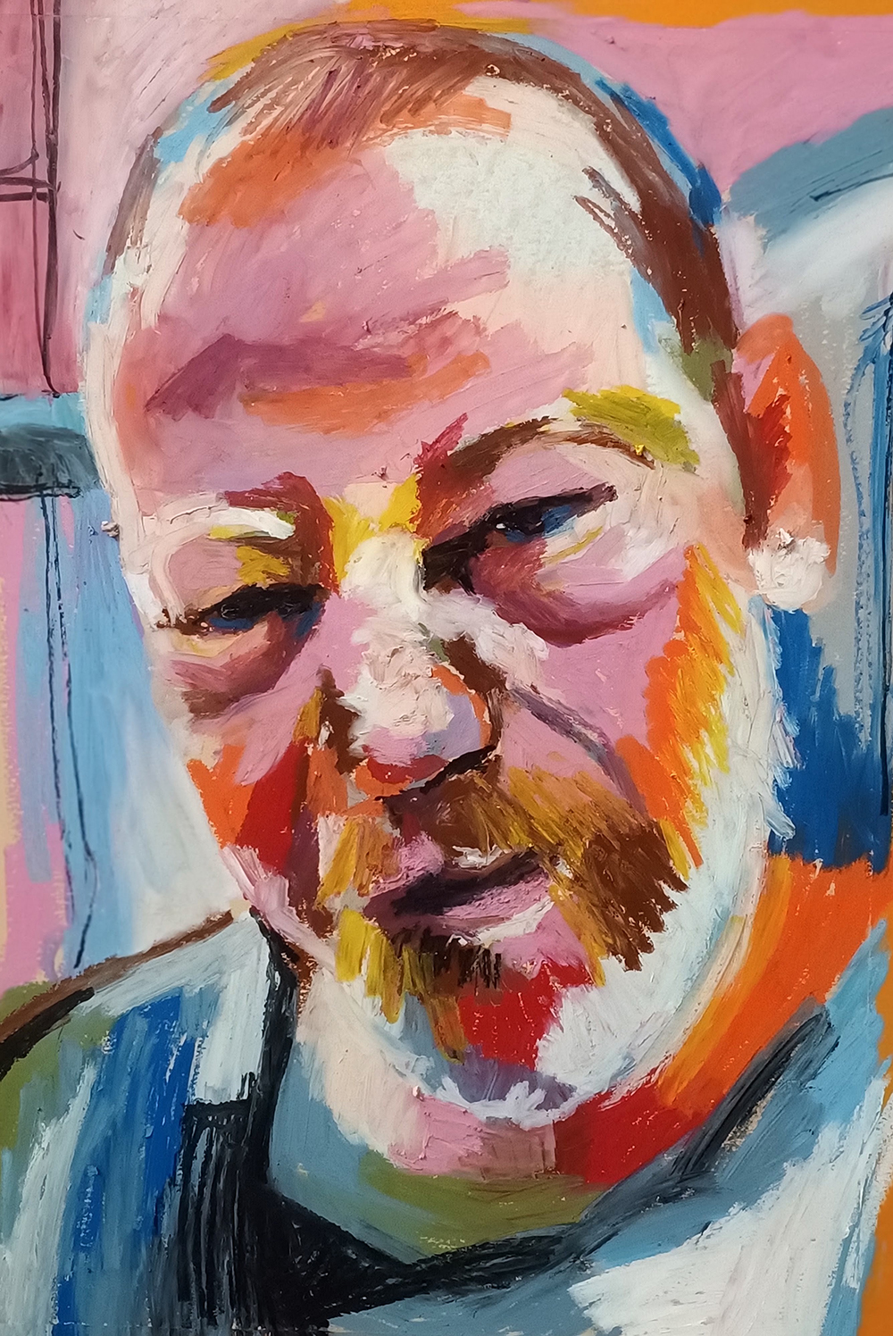
What unites the submission, across three quite different techniques, is an unusual comfort with imperfection as content rather than accident. Torn cardboard, a stray drip, a pastel edge left ragged — Białas does not correct these; she incorporates them, and the work is more honest for it. The technical range on display — controlled ink drawing, disciplined linocut, patient Micron fineliner work, and looser expressive oil pastel — is a genuine strength at this stage of a practice, though it also means the oil pastel portraits currently trail the ink drawings and the linocut in resolution. If there is a clear next step, it is bringing the oil pastels’ color confidence into closer alignment with the structural discipline already evident in the drawings and the print, so that the gesture serves the likeness as precisely as the line already does.